Doctor Who: Worlds Apart
UX Designer
Oct 2021 - Mar 2023
Doctor Who: Worlds Apart is a web 3.0 digital trading card game available on the Epic Games Store. While working on the projected I improved aesthetic usability of the game's trading cards and prototyped new menu flows to enhance accessibility.

Case Study
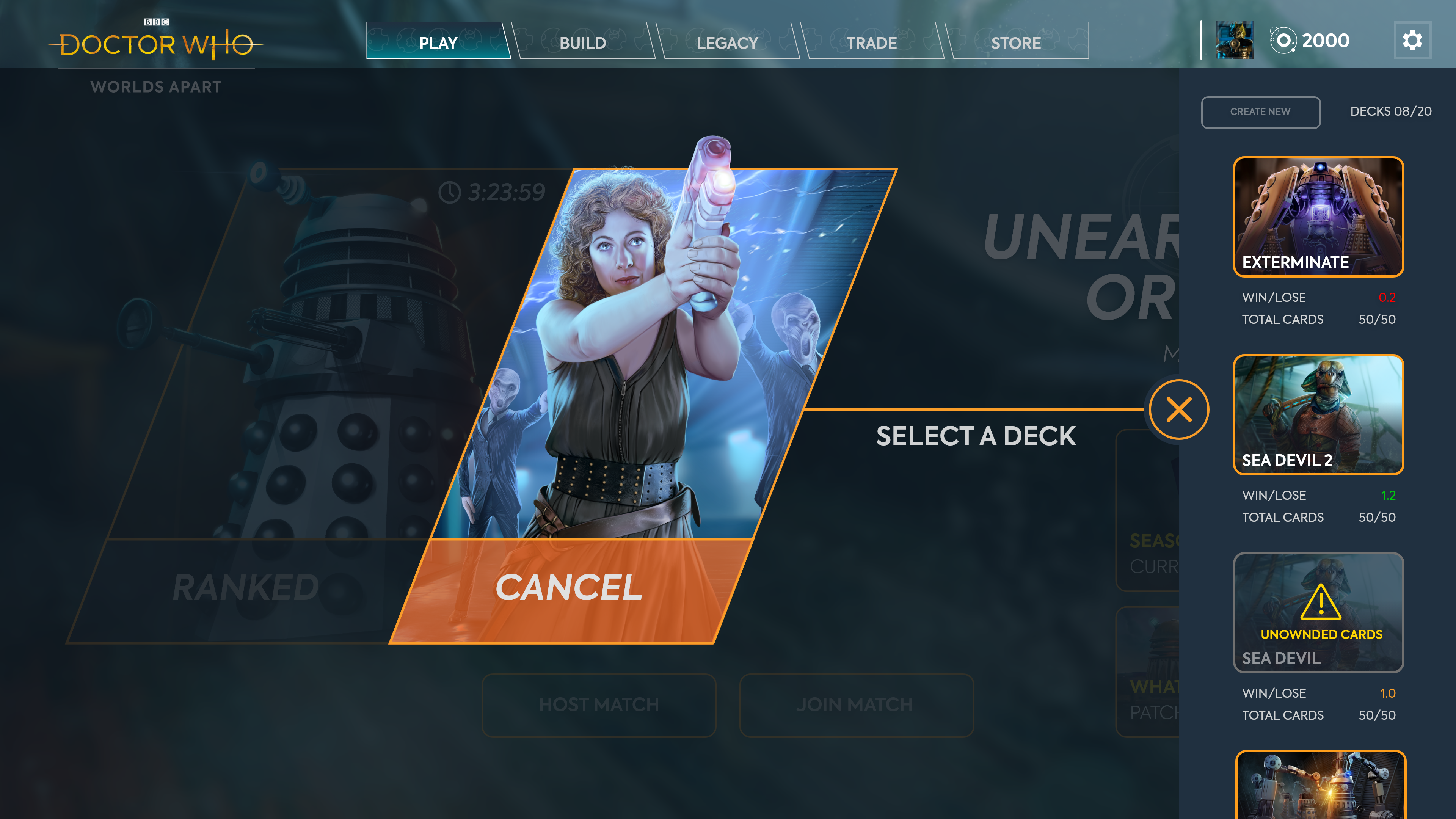
While working on Doctor Who: Worlds Apart, I conducted a redesign of the games trading card aimed at improving pre-launch sales of card packs. From a deep dive analysis of existing player feedback (and a self-conducted heuristic evaluation), I established that the existing card designs did not meet consumer expectations when compared to competitor products on the market. The three core issues I picked out were...
- Lack of hierarchy to help establish which information is most important to a player
- Cheap overall feeling to the presentation that felt dated compared to trending competitor products
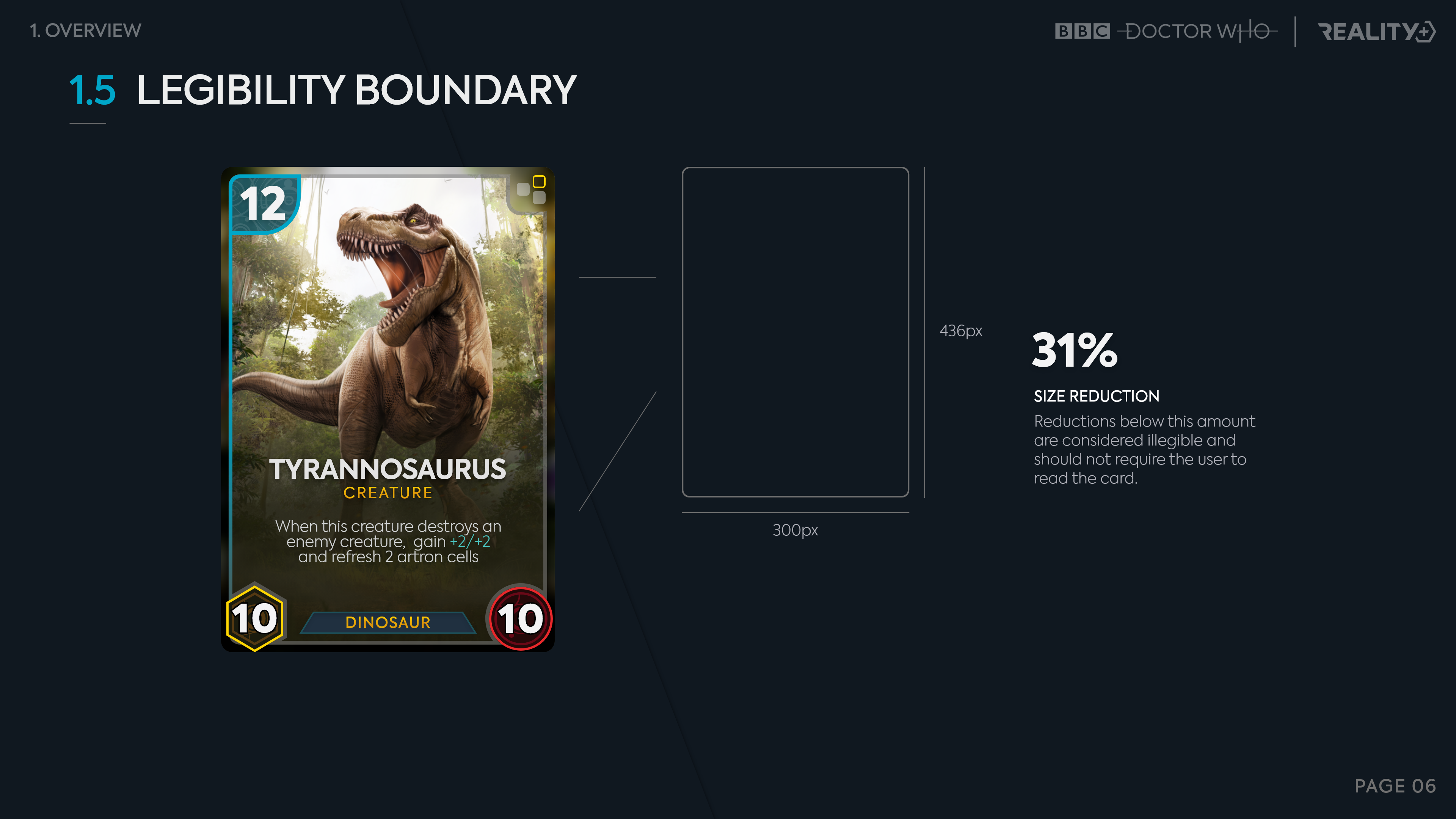
- Legibility issues with text falling below generally established screen safe font sizes
To rectify the identified issues, I conducted extensive competitor research to find the elements our cards were missing. I then held iterative workshops to generate ideas for new layouts with the design team that both aligned with their gameplay vision but also the UX improvements I had in mind. Finally, I created high-fidelity mock-ups to present to stakeholders.
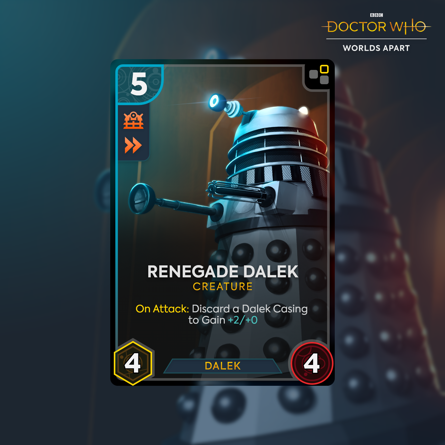
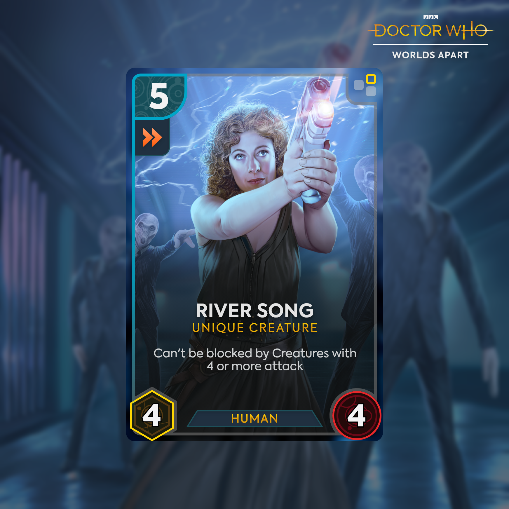
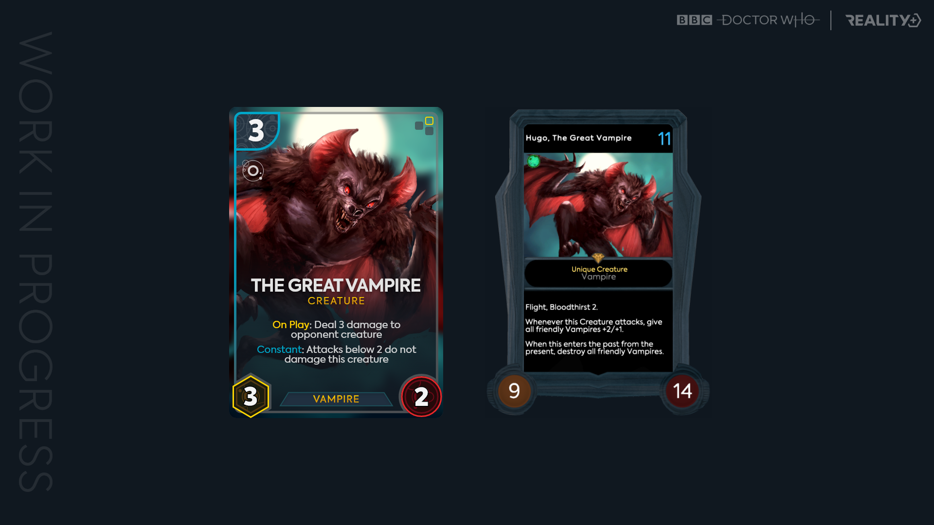
Below is a before and after, with the old card design on the right.
Once I'd established a new design, I created a style guide that broke down all the changes developers needed to know for implementation. This document was used internally as a source of truth for future card creation up until the projects shift to a more mobile focused design.
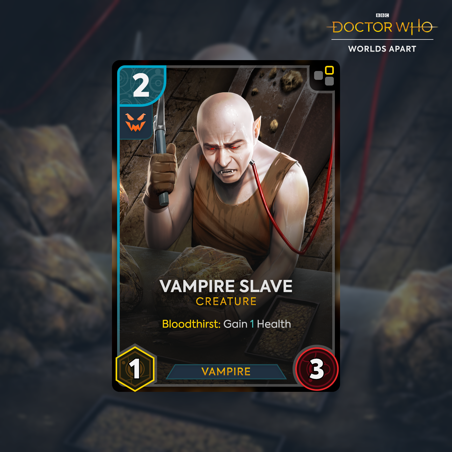
This document was shared with both internal developer teams but also the BBC for approval.
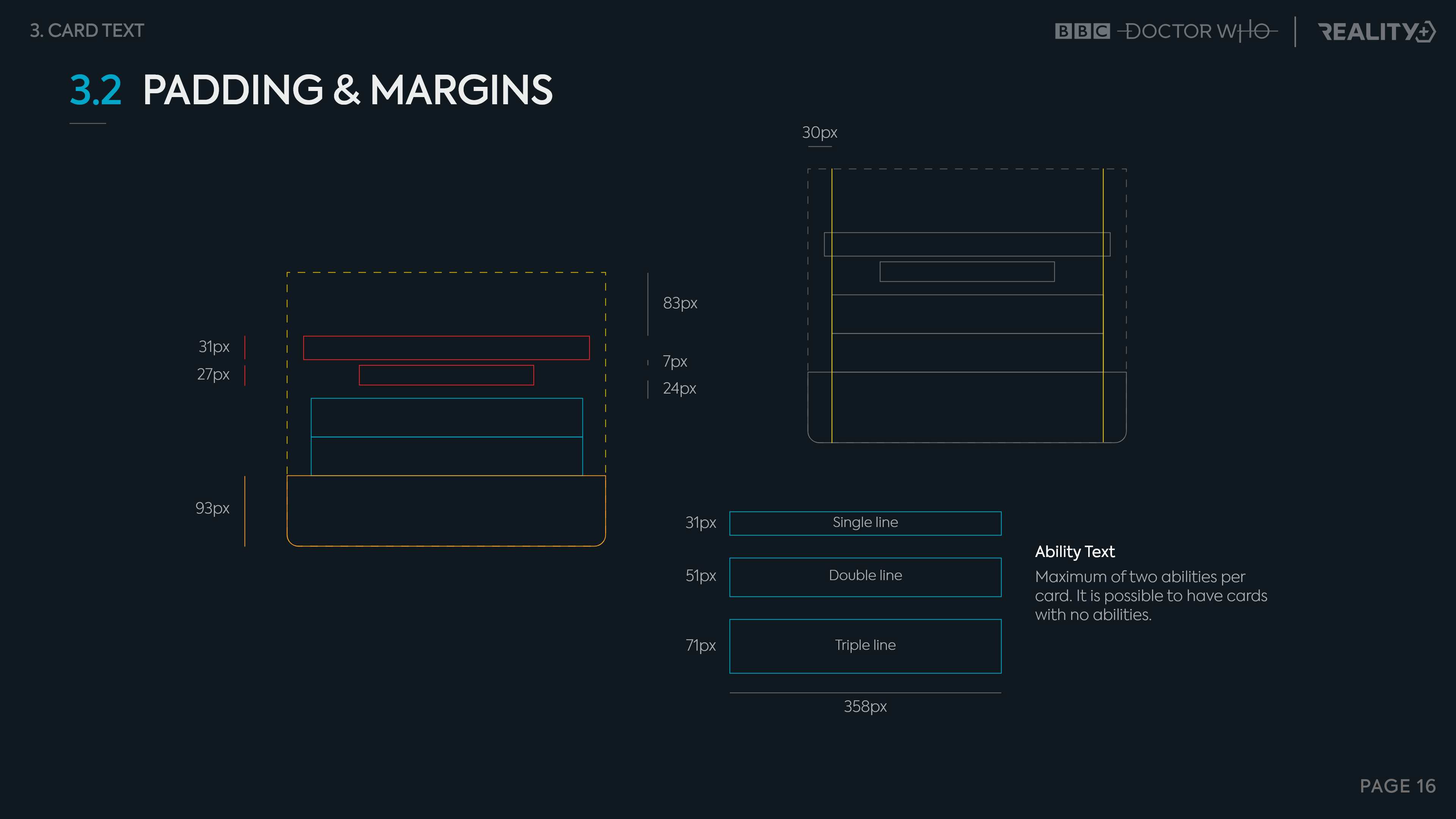
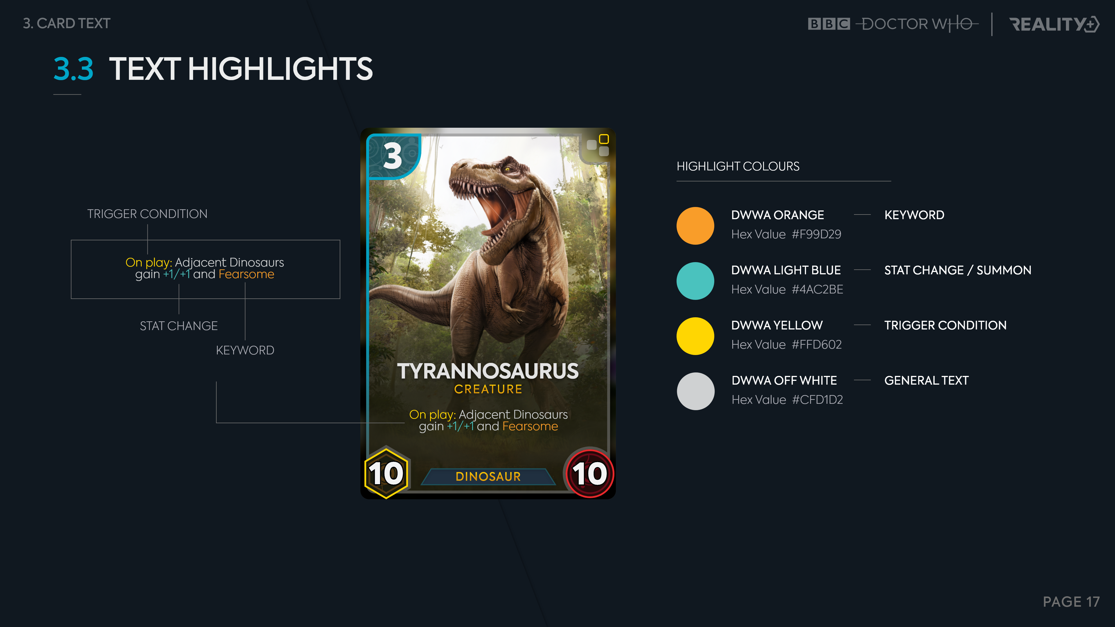
Below are a few extracts from that document...